

Grey leads composite decking colours in Canada, followed by black/charcoal and warm brown/espresso. The right shade depends on your light (overcast Ontario flattens it; bright BC intensifies it), your siding, and how much sun the deck takes. Order physical samples before you commit.
Short answer: Grey is the most popular composite decking colour in Canada, followed by black/charcoal and warm brown/espresso tones. The right shade depends on your light (overcast Ontario flattens colour; bright BC intensifies it), your home's siding, and heat. Order physical samples before you commit.
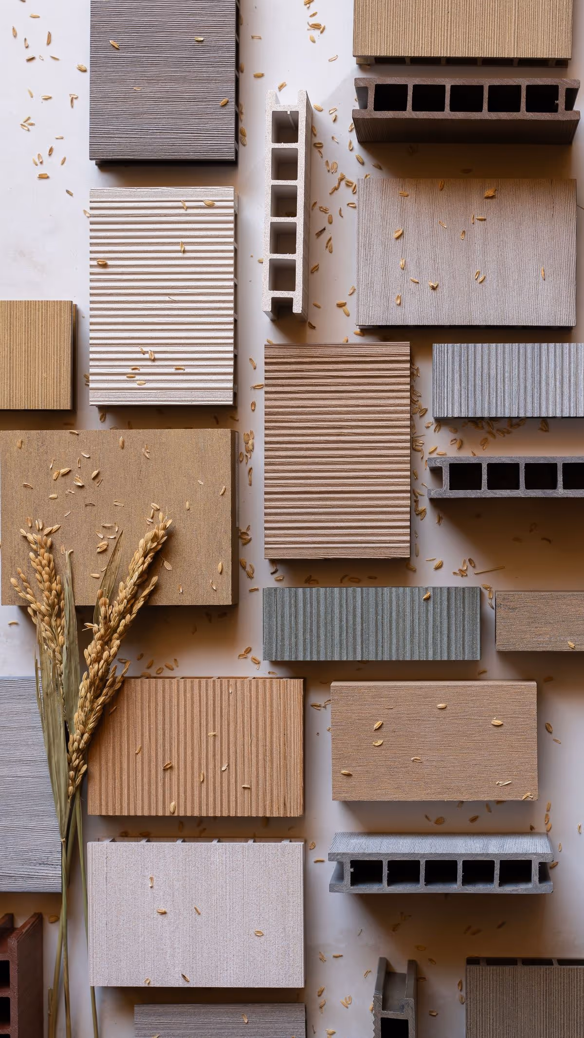
Of every decision you'll make on a deck, colour is the one you live with longest. It's the call that decides whether the finished deck reads as a natural extension of your home or fights the siding, shows every footprint, and ages unevenly in the sun — and you're committing to it for 25 years. We supply Tarimatec stone composite across Canada and work alongside the builders who install it, which means we see how these colours actually land in real backyards, from Halifax to Kelowna. So this guide breaks composite decking colours down by family, maps each family to the Tarimatec composite decking range of 31 colours, and gives you Canada-specific guidance on light, heat, and house-matching so you can choose once and choose right.
A quick word on what you're choosing, because the material changes how the colour behaves. Tarimatec is a stone composite decking system — a mineral-rich blend of roughly 50% rice husk (an agricultural by-product) and recycled ground calcite in a PVC matrix. It is European-engineered (made in Spain by Plásticos Viters S.A., a manufacturer with 70+ years of experience), selected for Canadian weather, and distributed exclusively in Canada by Zinodeck. That mineral composition matters for colour: stone composite holds its tone and resists UV fade and heat build-up better than the wood-fibre composites (standard WPC) that fill most Canadian colour charts.
Before you scroll through hundreds of brand-specific swatch names and lose the thread, sort the field into families — it's the fastest way to narrow your choice. Almost every composite deck board on the Canadian market falls into one of five.
Here's a Toronto example of why families beat swatch names: two homeowners on the same west-end street both say they want "grey," but one has a south-facing deck baking off an alley and the other a shaded north-side patio — and the same board reads cooler and darker on the shaded one. Sort by family first, then fine-tune the tone to your light. The table below maps these five families to the three Tarimatec collections so you can see at a glance where to look in the 31 colours and finishes range.
| Colour family | Best for | Tarimatec collection | Heat in direct sun | Hides dirt |
|---|---|---|---|---|
| Grey (cool, warm, greige) | Modern, transitional, farmhouse homes | Chromatic, Wood | Low–medium | Excellent |
| Black / charcoal | Contemporary homes, white/light siding, black trim | Chromatic | Highest | Good (shows dust/pollen) |
| Brown / espresso | Cottages, wood-clad and brick homes, traditional looks | Wood, Chromatic | Medium–high | Excellent |
| Natural wood-tones | Homeowners wanting real-timber warmth, low maintenance | Wood | Low–medium | Very good |
| Bold / ethnic / stone-look | Design-led projects, rooftops, poolside, commercial terraces | Ethnic | Varies by tone | Excellent (multi-tonal) |
If you're hedging your bets and want the colour that's hardest to get wrong, you're already circling the answer most Canadians land on: grey. It has held the top spot for several years running, and there are three practical reasons it dominates Canadian decks specifically.
Picture a new build in Calgary with greige fibre-cement siding and black window frames — the look that's gone up on half the streets in the city. A mid-grey deck is the colour that disappears into that palette instead of arguing with it, and it's the one we get asked to match more than any other. Within grey, the trend for 2026 has shifted away from the flat, cool "battleship" greys of the early composite era toward warm greys and greige multi-tones — boards with subtle brown or taupe undertones and gentle streaking that read as more natural and less industrial. In the Tarimatec line, you'll find these tones across the Chromatic collection (for cleaner, modern greys) and the Wood collection (for grey-driftwood and weathered-timber looks). Browse the full spread on the colours and finishes page.
If grey is the safe default, the 2026 design direction is warm and tonal: warm greige, soft driftwood, and rich espresso-brown are the colours designers are specifying most for new Canadian builds, with black/charcoal holding strong on contemporary architecture. The single biggest shift is the move toward multi-tonal boards — where each plank carries two or three blended shades rather than one flat colour — because they read more like real wood or natural stone and disguise scuffs and debris far better than a uniform board. On the builder side of things, that's the upgrade we point people to first: a multi-tonal board forgives a backyard's real life in a way a dead-flat colour never does.
You've got a family in mind — now you need to know which of the three Tarimatec collections to actually open, because each one leans toward a different end of the spectrum and knowing that saves you a lot of scrolling.
The Chromatic collection is where the contemporary palette lives: crisp cool greys, deep charcoals and near-blacks, and clean modern neutrals. This is the collection to start with if your home is modern or transitional, your trim is black, or you want the architectural, minimalist European look. Most Canadian homeowners choosing grey or black/charcoal find their colour here — it's the collection behind the majority of the city decks we supply.
The Wood collection covers the warm end of the spectrum: natural oak and teak looks, honey and golden tones, rich espresso browns, and grey-driftwood shades that bridge the grey and brown families. If you want the look of real timber — the warmth of cedar or the depth of walnut — without sanding, staining, or sealing every year, this is your collection. Think of a Muskoka cottage where the owners want cedar warmth against the treeline but refuse to spend another summer holiday on their knees with a stain brush; this is the range that gets them there. It's the most popular collection for cottages, lakefront properties, and brick or wood-clad homes.
The Ethnic collection is the textured, statement-making range: deeper multi-tonal boards and stone-look finishes built for design-led residential projects, rooftops, poolsides, and commercial terraces. These colours carry the most visual movement, which makes them superb at hiding dirt and traffic and gives a high-end, bespoke feel to a space — the kind of finish we see specified on Toronto rooftop terraces where every square foot is on display.
You've narrowed the colour — now the finish decides how that colour actually reads underfoot and how the deck performs in the wet. Colour is only half the decision; the finish (the surface texture of the board) changes both. Tarimatec offers three, and the same colour can look noticeably different depending on which you choose.
| Finish | Surface | Look | Best use |
|---|---|---|---|
| Nature | Subtle natural wood-grain texture | Warm, organic, most timber-like | Residential decks where you want a natural, realistic wood look |
| Tecno | Smooth, refined surface | Clean, contemporary, minimalist | Modern homes, architectural and rooftop projects, a sleek finish |
| Surco | Linear anti-slip grooves | Defined, linear, technical | Wet and high-slip areas: poolside, rooftops, balconies, stairs |
A practical rule for Canada, and the one we give builders every time: choose Surco anywhere water collects or freezes — pool surrounds, rooftop terraces, balconies, dock-side decks, and stair treads — because its anti-slip linear groove gives surer footing when the surface is wet or iced over. A Kelowna pool deck in August and a Halifax stair tread slick with November freezing drizzle are the same problem, and Surco is the answer to both. Choose Nature for the most authentic wood look on a typical backyard deck, and Tecno when you want a smooth, modern surface. All three are pedestal- and rooftop-compatible and come in plank and tile formats.
If you've been stuck circling these two for a week, you're in good company — it's the most common colour deadlock we hear, and the honest answer is that it comes down to your home and the mood you want. Neither is "better." They suit different houses.
| Consideration | Choose grey if… | Choose brown if… |
|---|---|---|
| Home style | Modern, transitional, or farmhouse; black or white trim | Traditional, rustic, brick, or wood-clad; cottage or lakefront |
| Siding | Grey, white, greige, blue-grey, or charcoal cladding | Beige, tan, red brick, cedar, or earth-toned cladding |
| Mood | Cool, crisp, contemporary, architectural | Warm, cozy, natural, inviting |
| Light | You have overcast or shaded conditions and want it to stay clean-looking | You have bright sun and want warmth that does not wash out |
| Dirt | You want maximum disguise of pollen and salt grit | You want maximum disguise of mud, leaves, and organic debris |
If you genuinely can't decide, a warm greige — a grey with brown undertones — splits the difference and is one of the most flexible choices on the market. A lakefront deck in the Kawarthas is the perfect case for it: it reads grey enough to sit calmly against a slate roof, and warm enough not to go cold against the cedars and the water. It's also why the Tarimatec Wood collection's driftwood and weathered tones are so popular — they read as grey from one angle and warm from another.
If you've ever fallen for a board in a showroom and felt let down when it got home, light is almost always the culprit — and Canada has dramatically different light from coast to coast. The same board genuinely looks like two different colours in Halifax versus Kelowna, and it's the most underrated factor in colour selection.
Under flat, diffuse, overcast light — the default for much of the Ontario, Quebec, and Atlantic deck season — colours appear cooler, softer, and slightly darker than they do on a sunny showroom swatch. Mid-tones lose contrast and very dark boards can read as flat and heavy. We've watched a charcoal that looked rich and architectural on a Toronto showroom floor turn into a dead, heavy slab on a client's overcast east-Toronto deck the following week — same board, different sky. In these conditions, grey and warm-greige boards hold up best, and a multi-tonal board keeps the visual interest a flat colour loses. If you're choosing a dark board for an Ontario or Maritime deck, lean toward charcoal with some tonal variation rather than a dead-flat black, so it doesn't look like a void on a grey day.
Under strong, direct sun — common in the BC interior, Alberta, and Saskatchewan, and on any south- or west-facing deck — colours appear brighter, warmer, and more saturated, and contrast is amplified. Dark boards look richer but get hotter; very light boards can throw glare. A Kelowna or Kamloops deck takes punishing high-UV summers, and this is exactly where stone composite's UV stability earns its keep: because the colour and minerals are engineered to resist UV fade, the board you choose holds its tone for years rather than chalking or washing out the way some wood-fibre composites and stained timber do under that kind of sun.
The takeaway: never finalise a composite decking colour from a screen or a tiny printed swatch. Order a physical sample and look at it on your actual deck, at different times of day, in both sun and shade. You can order Tarimatec samples online and see exactly how each colour behaves in your light before you buy a single board.
If you've got kids, a dog, or a barefoot habit and you're eyeing a black board, this is the right question to ask before you commit — and it deserves a plain answer: any dark decking surface — wood, WPC, PVC, or stone composite — gets warmer in direct sun than a light one. Colour is the dominant driver of surface temperature, so a black board will always be hotter underfoot than a pale grey one on the same sunny afternoon. No manufacturer can repeal physics, and you should treat any claim that a dark board "stays cool" with healthy skepticism.
Walk a south-facing Toronto deck off a west-end alley in mid-July and you'll feel exactly what the spec sheet is trying to warn you about: a dark wood-fibre board can climb past 60°C in full afternoon sun — hot enough that bare feet do the little hop to the nearest shade and the dog refuses it outright. What differs between materials is the degree and the durability. Stone composite's mineral content (the ground calcite and rice husk) gives it more favourable thermal behaviour than many wood-fibre WPC boards, so it tends to build up and hold less heat than a wood-flour composite of the same colour. Standard capped WPC, by contrast, is often the one cited for running hot in full sun. So while no dark board is cool, a dark stone composite board is generally a more comfortable choice than a dark WPC board.
Practical ways to manage heat in a Canadian summer:
If you're tired of a deck that looks dirty two days after you clean it, colour does a lot of the work here. The best dirt-hiding composite colours are mid-tone, multi-tonal browns and greys — boards that are neither very light nor very dark and that carry some streaking or colour variation. Here's why the extremes struggle:
Think about a deck under a big maple in an Ottawa backyard: spring drops yellow pollen, fall drops tannin-staining leaves, and a kid tracks mud across all of it. A dead-black board flags the pollen and a bone-white board flags the leaf stain, but a mid-tone streaked board quietly absorbs both. Texture helps too. A wood-grain (Nature) or grooved (Surco) surface disguises surface scuffs and debris better than a flat, glossy finish, where every mark catches the light. Whatever colour you choose, stone composite keeps upkeep easy: it doesn't need sanding, staining, or sealing, and routine dirt cleans off with soap and water.
If what sold you on a deck in the first place was the look of real timber — and you only moved to composite to escape the upkeep — then this is the section that matters most to you. The most realistic wood-look composite boards combine three things: a warm, natural colour (honey, oak, teak, or espresso rather than flat grey), a multi-tonal streaked colouring that mimics real grain variation, and a genuine wood-grain surface texture. A flat, single-colour board with a smooth surface will always look like a manufactured product; a multi-tonal board with an embossed grain looks convincingly like timber.
This is the request we hear most from cottage owners: a Muskoka family who loved their old cedar deck but were done re-staining it every other June, wanting the same warmth that won't grey out and splinter by the dock. For that, the most authentic timber appearance in the Tarimatec range comes from the Wood collection in the Nature finish — natural oak, teak, and walnut-look tones with a subtle grain texture. It gives you the warmth and character of a freshly oiled hardwood deck with none of the annual maintenance, splintering, or weathering. The best composite decking comparison for Canada goes deeper on how stone composite holds that wood look over 25 years versus other materials.
If you remember a neighbour's early composite deck going blotchy and grey within a few summers, that memory is doing real work on your decision — and it deserves a straight answer. All exterior surfaces exposed to sun lighten somewhat over their lifetime — that's true of wood, paint, vinyl, and every composite. The meaningful difference is how much and how evenly. Early-generation, uncapped wood-plastic composites were notorious for noticeable, blotchy fading within a few years. Modern capped composites are far better, and stone composite is better still.
Take a fully-exposed, south-facing deck on the Prairies — no tree cover, hard UV from May to September, year after year. That's the trial that exposed cheap composites a decade ago, and it's the trial Tarimatec is engineered for: the result is colour that holds remarkably well over time — slow, even, and minimal rather than patchy. A small amount of gentle, uniform mellowing in the first season is normal and expected for any quality board as it settles; what you won't get is the dramatic, uneven fade that plagued cheap composites. This durability is backed by the product's 25-year warranty and its EPD-verified, ISO-certified manufacturing. You can read the full credentials, including the verified Environmental Product Declaration, on the EPD and sustainability page.
If you're quietly planning to "just paint it later" as a hedge against picking the wrong colour now, here's the honest steer: you can, but you almost certainly should not, and with a quality composite you won't need to. Composite decking is engineered not to absorb finishes the way wood does, so paint and stain struggle to bond, tend to peel and flake, often void the manufacturer's warranty, and lock you into a lifetime of re-coating — which defeats the entire low-maintenance purpose of buying composite in the first place.
The right approach is to choose the correct colour at purchase from the 31 available shades and let the board's engineered, fade-resistant colour do its job for the next quarter-century. This is precisely why ordering samples first matters so much: with composite, the colour you pick is the colour you live with, so it pays to get it right once. Here's a real-world reason it matters that comes up two years down the line — if a board ever gets gouged and needs swapping, a through-coloured composite still matches; a painted deck means re-coating the whole thing to hide one new board. If your taste changes years later, the better move is replacing boards (the colour runs right through) rather than coating them.
If you're working with a townhouse balcony or a tight city courtyard rather than a sprawling backyard, colour can genuinely change how big the space feels. Lighter and mid-tone colours make the area feel larger and brighter, while very dark boards can make a small space feel smaller and more enclosed. A light-to-mid grey or a warm natural wood-tone opens up a shaded downtown Toronto condo balcony — exactly the kind of compact, low-light space where a near-black board would close the walls in.
Two more small-space tips:
For rooftops and balconies specifically, pair a light-to-mid colour with the Surco anti-slip finish for safe footing in wet weather, and consider the tile format on a pedestal system for a clean, modern installation over a membrane.
If you keep holding a swatch up to your siding and it lands in an awkward almost-match, that's the trap to avoid — there's no single rule, but the most reliable design principle is contrast with intention: your deck should either clearly complement or clearly contrast the house, never sit in a near-miss. Three approaches work consistently:
One piece of hard-won advice: pull your colour cue from a fixed element you're not going to change — the roof, the brick, the window frames, or the stone — rather than from the siding alone. We've watched a deck colour chosen to match the siding fall out of step the year the owners repainted the house; red brick and a slate roofline, by contrast, are still there in 2034. And always check the pairing with a physical sample against the actual house, in your actual light.
Once you've settled your main field colour and you want the deck to look custom rather than catalogue, a second colour used as a picture-frame border or feature inlay is the single easiest way to get there. A border is a perimeter band of boards (often one or two planks wide) in a contrasting colour that frames the field, hides the cut ends of the field boards, and gives a finished, intentional edge.
Proven combinations from the Tarimatec range:
On a large Calgary backyard deck we supplied boards for, a charcoal picture-frame border around a warm-greige field did more to make the space feel designed than any single colour could have on its own. Other ways to use colour structurally: change board direction (diagonal or herringbone) within a single colour to define a lounging zone; use a contrasting band to separate a cooking area from a seating area; or wrap exposed sides with colour-matched fascia for a built-in, monolithic look. Because the Tarimatec range spans 31 coordinated colours across three collections, mixing within the line is straightforward and the tones are designed to work together. To estimate how much of each colour you'll need and what it costs in Canadian dollars, run your dimensions through the CAD cost calculator.
If you're standing in the backyard trying to make a board agree with the siding, the brick, and the lawn all at once, the goal is harmony, not a perfect match — an exact match to your siding usually looks flat, so aim for colours that share an undertone but differ in depth. A simple, reliable process:
For trade professionals specifying colour across multiple units or a commercial terrace, Zinodeck's trade and dealer program provides full-colour support, samples, and project guidance to keep palettes consistent at scale.
If you're cross-shopping brands, it's worth knowing that colour is also a materials decision — the same shade behaves differently depending on what the board is made of. In the interest of an honest comparison, every quality capped composite on the Canadian market today resists fade far better than the uncapped boards of a decade ago, and the major WPC brands offer excellent, realistic colour ranges. Where stone composite differentiates is on heat behaviour and long-term UV stability — the two things a Prairie sun or a south-facing Toronto deck will test hardest.
| Attribute | Tarimatec stone composite | Standard wood-plastic composite (WPC) |
|---|---|---|
| Core composition | ~50% rice husk + recycled ground calcite in PVC | Wood flour/fibre + recycled plastic |
| Colour range | 31 colours, 3 collections, 3 finishes | Varies by brand; typically 4–12 colours per line |
| Heat build-up (same colour) | Lower; mineral content moderates surface heat | Often higher; wood flour holds heat |
| UV / fade stability | Engineered for high UV stability | Good on capped boards; weaker on uncapped |
| Freeze-thaw movement | Low moisture absorption, stable in freeze-thaw | Wood fibre can absorb moisture over time |
| Anti-slip finish option | Surco linear-groove finish | Brand-dependent |
| Warranty | 25 years | Varies (commonly 25–50 years on capped) |
| Recyclability / EPD | 100% recyclable; EPD verified; ISO 9001 + 14001 | Brand-dependent |
If you're weighing Tarimatec against the big North American brands specifically, the best Trex alternatives in Canada guide compares the ranges, climate performance, and colour options side by side.
If you've read this far and just want the decision boiled down, here's the order we'd walk you through it in on a site visit:
When you're ready, order your Tarimatec colour samples, explore all 31 shades on the colours and finishes page, and use the CAD cost calculator to price your project. Full boards are available quote-direct through Zinodeck, Canada's exclusive distributor of Tarimatec Ecofiber stone composite decking — we'll help you match a colour to your light and work alongside the builder who installs it.
Grey is the most popular composite decking colour in Canada, especially warm greys and greige multi-tones. It suits the modern, transitional, and farmhouse homes common in Canadian construction, pairs with grey, white, and black-trimmed siding, and hides pollen and salt grit well. Black/charcoal and warm espresso-brown are the next most popular families.
The 2026 direction is warm and tonal: warm greige, soft driftwood, and rich espresso-brown lead for new Canadian builds, with black and charcoal staying strong on contemporary homes. The biggest shift is toward multi-tonal boards that carry two or three blended shades per plank, which look more like real wood and hide dirt and scuffs better than flat colours.
The safest, most popular choice is a deck slightly darker than the house — for example a charcoal or espresso deck under white, greige, or light-grey siding — which grounds the space. A lighter deck against dark siding creates a bright, airy contrast. Either way, pull your colour cue from a permanent element like brick or roofline, and test a sample in place.
Any dark decking surface gets warmer in direct sun than a light one, because colour drives surface temperature. On a south-facing Canadian deck a dark board can climb past 60°C in July. Stone composite's mineral content moderates heat better than many wood-fibre WPC boards of the same colour, but no dark board stays cool. For sunny, barefoot areas choose mid-tones or lighter greys, and reserve black/charcoal for shaded or shoes-on spaces.
The most realistic wood look comes from a warm, multi-tonal colour (honey, oak, teak, or espresso) in a genuine wood-grain texture. In the Tarimatec range, the Wood collection in the Nature finish gives the most authentic timber appearance — the warmth and grain of hardwood with no sanding, staining, or sealing required.
You can paint or stain composite, but you should not: composite is engineered not to absorb finishes, so coatings peel, often void the warranty, and reintroduce the maintenance you bought composite to avoid. Instead, choose the right colour at purchase from the 31 available shades. The colour runs through the board and is engineered to resist fade for the 25-year warranty period.
{"@context":"https://schema.org","@type":"FAQPage","mainEntity":[{"@type":"Question","name":"What is the most popular composite decking colour in Canada?","acceptedAnswer":{"@type":"Answer","text":"Grey is the most popular composite decking colour in Canada, especially warm greys and greige multi-tones. It suits the modern, transitional, and farmhouse homes common in Canadian construction, pairs with grey, white, and black-trimmed siding, and hides pollen and salt grit well. Black/charcoal and warm espresso-brown are the next most popular families."}},{"@type":"Question","name":"What is the best composite decking colour in 2026?","acceptedAnswer":{"@type":"Answer","text":"The 2026 direction is warm and tonal: warm greige, soft driftwood, and rich espresso-brown lead for new Canadian builds, with black and charcoal staying strong on contemporary homes. The biggest shift is toward multi-tonal boards that carry two or three blended shades per plank, which look more like real wood and hide dirt and scuffs better than flat colours."}},{"@type":"Question","name":"Should my composite deck be lighter or darker than my house?","acceptedAnswer":{"@type":"Answer","text":"The safest, most popular choice is a deck slightly darker than the house, for example a charcoal or espresso deck under white, greige, or light-grey siding, which grounds the space. A lighter deck against dark siding creates a bright, airy contrast. Either way, pull your colour cue from a permanent element like brick or roofline, and test a sample in place."}},{"@type":"Question","name":"Do dark composite decking boards get too hot to walk on?","acceptedAnswer":{"@type":"Answer","text":"Any dark decking surface gets warmer in direct sun than a light one, because colour drives surface temperature. On a south-facing Canadian deck a dark board can climb past 60C in July. Stone composite's mineral content moderates heat better than many wood-fibre WPC boards of the same colour, but no dark board stays cool. For sunny, barefoot areas choose mid-tones or lighter greys, and reserve black/charcoal for shaded or shoes-on spaces."}},{"@type":"Question","name":"What composite decking colour looks most like real wood?","acceptedAnswer":{"@type":"Answer","text":"The most realistic wood look comes from a warm, multi-tonal colour such as honey, oak, teak, or espresso in a genuine wood-grain texture. In the Tarimatec range, the Wood collection in the Nature finish gives the most authentic timber appearance: the warmth and grain of hardwood with no sanding, staining, or sealing required."}},{"@type":"Question","name":"Can I change the colour of composite decking by painting or staining it?","acceptedAnswer":{"@type":"Answer","text":"You can paint or stain composite, but you should not: composite is engineered not to absorb finishes, so coatings peel, often void the warranty, and reintroduce the maintenance you bought composite to avoid. Instead, choose the right colour at purchase from the 31 available shades. The colour runs through the board and is engineered to resist fade for the 25-year warranty period."}}]}